The technical documentation is a work in progress.
Putting Content in Columns
Bootstrap’s grid system uses a series of containers, rows, and columns to layout and align content. It’s built with flexbox and is fully responsive.
If needed, you can put content into multiple columns using the ==== shortcode. Columns are separated by [==].
Example :
In bootstrap5 we have :
bootstrap5
<div class="container">
  <div class="row">
    <div class="col-sm">
      One of three columns
    </div>
    <div class="col-sm">
      One of three columns
    </div>
    <div class="col-sm">
      One of three columns
    </div>
  </div>
</div>
In Namaskar we will have :
input
[====]
One of three columns
[==]
One of three columns
[==]
One of three columns
[/====]
output
One of three columns
One of three columns
One of three columns
2 columns
input
[====]
First column
 [img "cat/cat1.jpg" "nice cat" ]
[==]
Second column
 [img "cat/cat2.jpg" "nice cat" ]
[/====]
output
First column
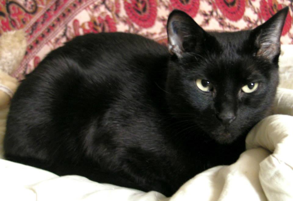
Second column

3 columns
input
[====]
First column
 [img "cat/cat1.jpg" "nice cat" ]
[==]
Second column
 [img "cat/cat2.jpg" "nice cat" ]
[==]
Third column
 [img "cat/cat3.jpg" "nice cat" ]
[/====]
output
First column

Second column

Third column

4 columns
input
[====]
First column
 [img "cat/cat1.jpg" "nice cat" ]
[==]
Second column
 [img "cat/cat2.jpg" "nice cat" ]
[==]
Third column
 [img "cat/cat3.jpg" "nice cat" ]
[==]
Fourth column
 [img "cat/cat4.jpg" "nice cat" ]
[/====]
output
First column

Second column

Third column

Fourth column

Advanced Columns
If we want 1 column on small screens, 2 columns on medium screens, 3 columns on medium screens, we can use the following :
input
[cols]
first image
 [img "cat/cat1.jpg" "nice cat" ]
[col]
2nd image
 [img "cat/cat2.jpg" "nice cat" ]
[col]
3rd image
 [img "cat/cat3.jpg" "nice cat" ]
[col]
4th image
 [img "cat/cat4.jpg" "nice cat" ]
[col]
5th image
 [img "cat/cat5.jpg" "nice cat" ]
[col]
6th image
 [img "cat/cat6.jpg" "nice cat" ]
[/cols]
output
first image

2nd image

3rd image

4th image

5th image

6th image
