The technical documentation is a work in progress.
Galleries
The Gallery feature allows you to add several images to your pages using a simple Shortcode.
Gallery with all images in a folder
The gallery shortcode is commonly used to display all images in a folder. For example, to display all images in the media/img/cat folder :
important
- Galleries must be located in a subdirectory of
media/img/. - All files in this directory must be images.
Galleries with data structures
Let's say I have in the data.ini config file the following data:
[data]

sites : [
{
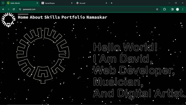
title: "Qwwwest.com",
thumb: "sites/qwwwest.com.jpg",
img: "sites/qwwwest.com.jpg",
link: "https://qwwwest.com"
}, {
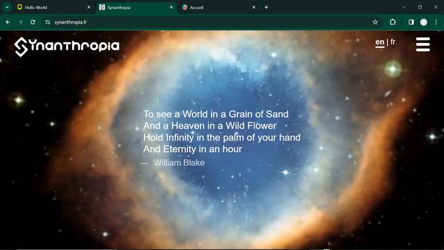
title: "Synanthropia.fr",
thumb: "sites/synanthropia.fr.jpg",
img: "sites/synanthropia.fr.jpg",
link: "https://synanthropia.fr"
}, {
title: "Anakunda.fr",
thumb: "sites/anakunda.fr.jpg",
img: "sites/anakunda.fr.jpg",
link: "https://anakunda.fr"
}, {
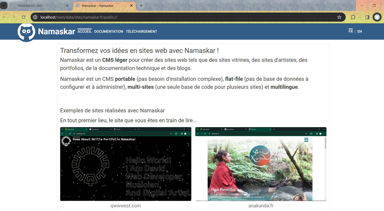
title: "Namaskar.fr",
thumb: "sites/namaskar.fr.jpg",
img: "sites/namaskar.fr.jpg",
link: "https://namaskar.fr"
}
]

backoffice: [
{
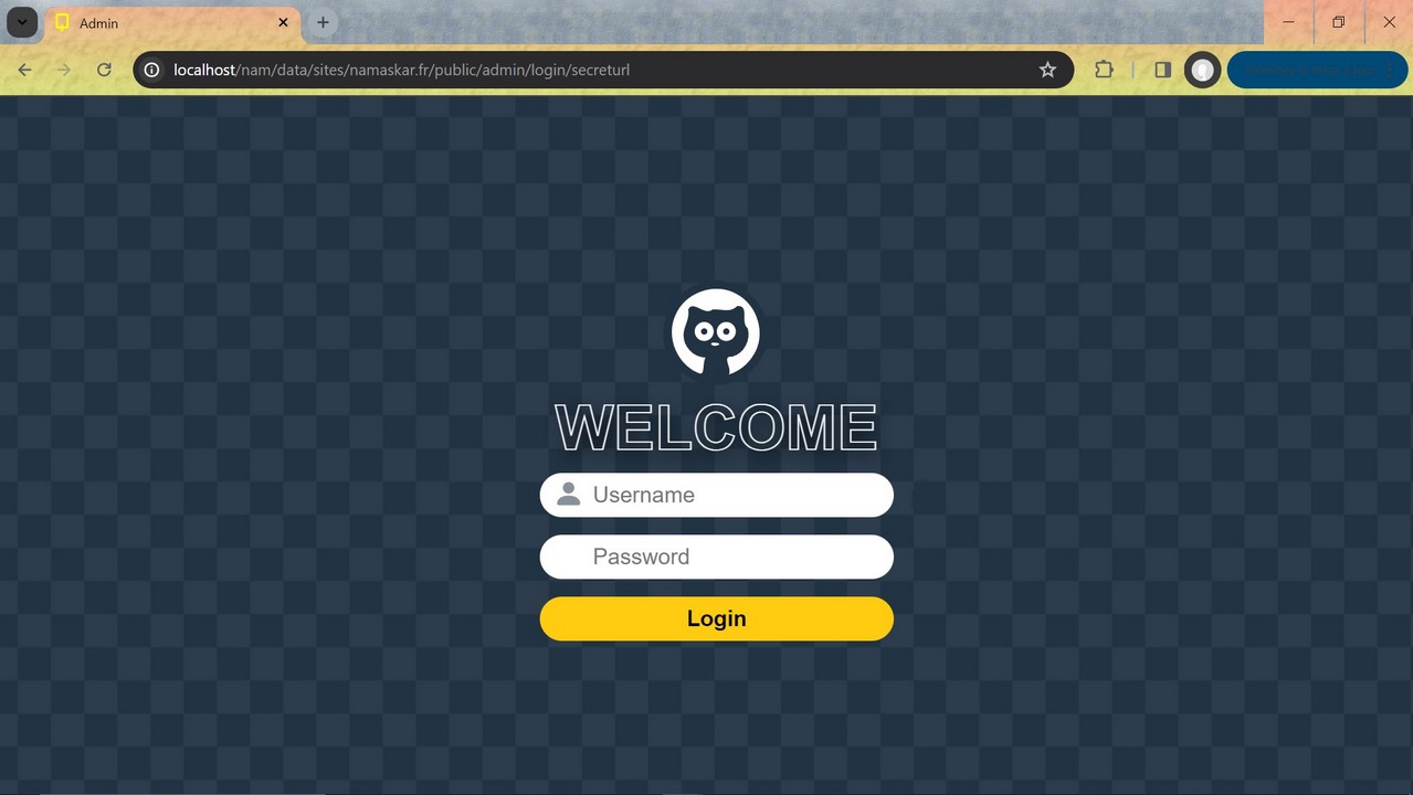
title: "Login",
thumb: "doc/login.jpg",
img: "doc/login.jpg"
}, {
title: "Backoffice",
thumb: "doc/backoffice.jpg",
img: "doc/backoffice.jpg"
}, {
title: "MediaManager",
thumb: "doc/ifm.jpg",
img: "doc/ifm.jpg"
}
]
I can simply turn these data into dynamic galleries...
Example with site pictures
Example with backoffice pictures
md=3 means there will be 3 columns.
Galleries with responsive columns
The columns are responsive.
To quickly set the number of columns that best render your galleries, use xs, md, lg, parameters.
[gallery items="data.sites" xs=2 md=3 lg=4 ]xs=2 means there will be 2 columns from mobile screens and up (1 is default).
md=3 means there will be 3 columns from medium screens and up (2 is default).
lg=4 means there will be 4 columns from large screens and up (default is md value).
Example :
Resize your browser to check the responsive design works... ^^
Usually, from my point of view, setting md is enough :

